Inkwell과 Container로 round값을 준 버튼에 버튼 색상과 다른 리플효과를 주려고 했는데
리플효과에는 라운드 처리가 안되는 것..........
이것저것 삽질 좀 잠시 하다가 찾은 방법
먼저 기존의 코드부터 보면..
import 'package:flutter/material.dart';

void main() {
  runApp(const MyApp());
}

class MyApp extends StatelessWidget {
  const MyApp({Key? key}) : super(key: key);

  @override
  Widget build(BuildContext context) {
    return MaterialApp(
      title: 'Flutter Demo',
      theme: ThemeData(
        primarySwatch: Colors.blue,
      ),
      home: const MyHomePage(),
    );
  }
}

class MyHomePage extends StatefulWidget {
  const MyHomePage({Key? key}) : super(key: key);

  @override
  _MyHomePageState createState() => _MyHomePageState();
}

class _MyHomePageState extends State<MyHomePage> {
  @override
  Widget build(BuildContext context) {
    return Scaffold(
      appBar: AppBar(
        title: const Text('Example'),
      ),
      backgroundColor: Colors.blueGrey,
      body: Center(
        child: InkWell(
          onTap: (){},
          child: Container(
              width: 100,
              decoration: const BoxDecoration(
                color: Colors.blue,
                borderRadius: BorderRadius.all(
                  Radius.circular(20.0),
                ),
              ),
              child: AspectRatio(
                aspectRatio: 1/1,
                child: Column(
                  mainAxisAlignment: MainAxisAlignment.center,
                  children: const [
                    Text("button", style: TextStyle(fontSize: 14),)
                  ],
                ),
              )
          ),
        ),
      ),
    );
  }
}
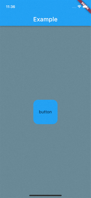
기존 코드와 아래 실행 결과를 보면 Container 안에 BoxDecoration을 넣어 라운드 처리를 해주었는데, 리플효과는 Container 안의 Color 밑으로 가려지는 현상을 볼 수 있다. 또한 리플효과는 라운드 처리가 되지 않고 정사각형 모양 으로 나오는 걸 확인할 수 있다.
그래서 먼저 InkWell에 borderRadius 값을 주었다.
borderRadius: const BorderRadius.all(
              Radius.circular(20.0),
            ),
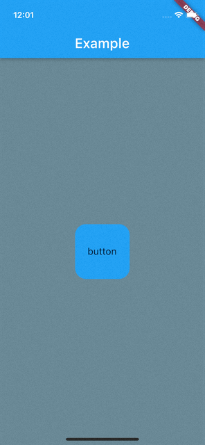
실행해 보았더니 아예 리플효과가 보이지 않는다.
아마 저 blue 색상에 가려진 듯 하다.
여기에 Ink를 사용해서 모양을 다시 잡아주자.
 import 'package:flutter/material.dart';

void main() {
  runApp(const MyApp());
}

class MyApp extends StatelessWidget {
  const MyApp({Key? key}) : super(key: key);

  @override
  Widget build(BuildContext context) {
    return MaterialApp(
      title: 'Flutter Demo',
      theme: ThemeData(
        primarySwatch: Colors.blue,
      ),
      home: const MyHomePage(),
    );
  }
}

class MyHomePage extends StatefulWidget {
  const MyHomePage({Key? key}) : super(key: key);

  @override
  _MyHomePageState createState() => _MyHomePageState();
}

class _MyHomePageState extends State<MyHomePage> {
  @override
  Widget build(BuildContext context) {
    return Scaffold(
      appBar: AppBar(
        title: const Text('Example'),
      ),
      backgroundColor: Colors.blueGrey,
      body: Center(
        child: Ink(
          width: 100,
          decoration: const BoxDecoration(
            color: Colors.blue,
            borderRadius: BorderRadius.all(
              Radius.circular(20.0),
            ),
          ),
          child: InkWell(
            onTap: (){},
            borderRadius: const BorderRadius.all(
              Radius.circular(20.0),
            ),
            child: AspectRatio(
              aspectRatio: 1/1,
              child: Column(
                mainAxisAlignment: MainAxisAlignment.center,
                children: const [
                  Text("button", style: TextStyle(fontSize: 14),)
                ],
              ),
            ),
          ),
        ),
      ),
    );
  }
}
Ink 위젯을 통해서 라운드 처리와 버튼 색상을 지정해 주었다.
InkWell child 속성에 Container를 지운 이유는 Ink위젯에서 모양과 색을 잡아주었기 때문에 중복해서 사용할 필요는 없다.
*AspectRatio : 자식 위젯을 일정한 비율로 만들어 주는 위젯
코드를 수정 후 실행해보면 원하는 대로 리플효과가 버튼 모양에 맞춰 잘 나오는 것을 확인할 수 있다.
리플효과의 색상을 변경하고 싶다면
highlightColor: Colors.red,
InkWell 속성인 highlightColor를 이용해보자.
추가++++
Column을 넣은 이유는 텍스트 말고도 이미지를 넣어주기 위해서 넣은 것이므로 빼도 무방하다.
Ink, InkWell을 사용하는 것 말고는 MaterialButton을 이용해서 하는게 더 편하다
SizedBox(
          width: 100,
          child: AspectRatio(
            aspectRatio: 1/1,
            child: MaterialButton(
              color: Colors.blue,
              shape: RoundedRectangleBorder(borderRadius:BorderRadius.circular(20.0)),
              onPressed: () {  },
              child: Column(
                mainAxisAlignment: MainAxisAlignment.center,
                children: const [
                  Icon(Icons.stop),
                  Text("button", style: TextStyle(fontSize: 14),)
                ],
              ),
            ),
          ),
        ),
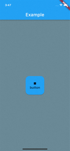
Material은 입체감을 주는 것 같다.
자신이 원하는 걸로 선택해서 개발하면 좋을 듯?
'소프트웨어 > Flutter' 카테고리의 다른 글
| [Flutter] BoxDecoration 그림자 효과 주기 (0) | 2022.03.14 |
|---|---|
| [Flutter] Dialog Navigator.pop()이 적용되지 않을 때 (0) | 2022.03.12 |
| [Flutter]IOS 카메라 권한 가져오기 (1) | 2021.12.22 |
| [Flutter]IOS 앱 다운로드 링크 만들 때 .plist 생성방법 (0) | 2021.12.08 |
| [Flutter] Slider TickMark 커스텀하기 (0) | 2021.12.07 |


